
16 min read
Alignment and Proximity
Line things up along invisible lines, and group related information so the design looks organised and reads easily.
Alignment
Nothing should be placed randomly. Every element should line up with something — the edge of a margin, another block of text, or the centre. In Photoshop, guides, smart guides and the Align buttons help you do this exactly.
- Left alignment is easiest to read for several lines of text.
- Centre alignment suits short, formal headings — but long centred paragraphs are hard to read.
- Pick one main alignment and stick to it.
Margins and Grids
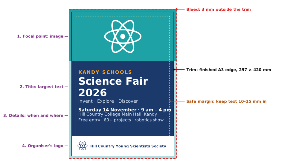
Designers often divide the page with a grid of columns and keep a margin round the edge. For an A3 poster, a margin of about 10–15 mm keeps text safely away from the edge, where printers may trim.
Proximity
Practice
What does proximity mean in design?
More lessons in Design Principles · Next: Contrast and Repetition · Previous: Visual Hierarchy